

A premium journal isn’t defined by how much is added to it but by how carefully every detail is considered. The difference between a standard notebook and a truly premium one lies in restraint, materiality, and a few standout design choices that elevate the entire experience.
A strong example of this is the Savarin luxury brand agency notebook. Designed as both internal stationery and a high-end PR gift, every element was chosen to reflect the standards expected of a luxury-facing brand.

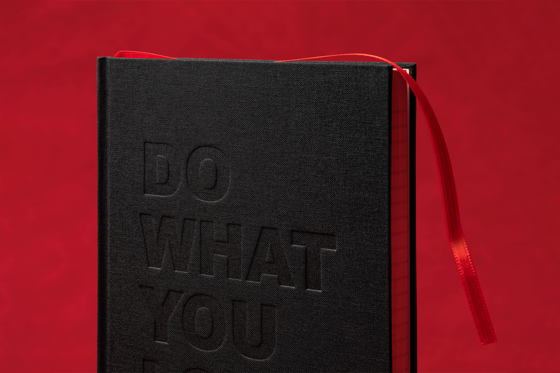
At the core of its premium feel is the material choice. A simple cloth cover might sound understated, but that’s exactly what makes it powerful. Cloth introduces a tactile softness and depth that coated or printed covers can’t replicate. It feels warmer in the hand, more considered, and instantly signals quality through touch alone. In this case, the simplicity of the cloth becomes a foundation for everything else.

Branding follows the same philosophy of subtle sophistication. Instead of relying on loud graphics, the notebook uses a combination of debossing and foil. The debossed logo adds quiet depth and shadow, while the foil catches the light just enough to stand out. This interplay allows branding to feel present without overpowering the design refined, controlled, and unmistakably premium.
But what truly defines this notebook is its most unexpected detail: the contrasting gilt edge. Rather than a traditional metallic finish, a bold red gilt edge was introduced. This creates a striking pop of colour when the notebook is closed, transforming an otherwise minimal object into something visually memorable. It’s a clever design decision subtle from the front, but impactful from the side that elevates the entire product.
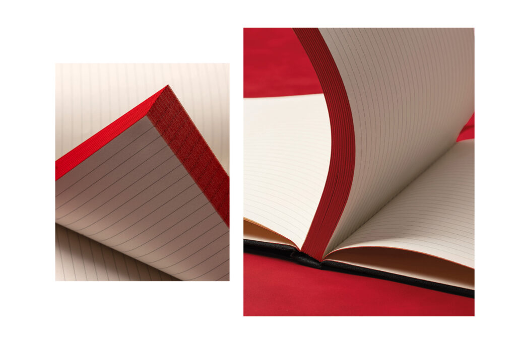
Additional touches like high-quality ivory paper, structured endpapers, and considered finishing details reinforce the sense of craftsmanship, but they never distract from the core idea: premium design is about balance.
Ultimately, what makes a journal feel premium isn’t excess. It’s the combination of texture, restraint, and one standout feature. In this case, a simple cloth cover, nuanced branding through debossing and foil, and a bold contrasting edge come together to create something that feels both elevated and effortlessly considered.